Volvo Cars - USA
I led the redesign of the Volvo Cars USA website, aiming to deliver a more seamless and engaging user experience. The project focused on modernizing the overall design, introducing new features to meet evolving customer needs, and optimizing the site to drive higher sales conversions. By improving usability, refining the visual identity, and streamlining key customer journeys—from vehicle exploration to purchase—I helped create a platform that not only reflects the premium Volvo brand but also supports business growth.

As a UX/UI Designer
I was responsible for end-to-end UX and UI design activities. My role involved collaborating with cross-functional teams, gathering requirements from business and product owners, conducting UX research, and translating insights into wireframes and prototypes. I performed user testing, designed high-fidelity mockups, created detailed flow diagrams, and conducted heuristic evaluations to ensure usability and consistency throughout the experience.
I primarily focused on key features, including the new car inventory, electrification initiatives, model landing pages, the South Florida pilot website, and lead-generation forms such as Get Local Price. These enhancements were designed to enhance the overall customer experience and increase sales conversions.
Design Tools: Sketch, InVision, Overflow, Flinto, and Zeplin.
User Testing: Applause (www.applause.com)
Location: Volvo Office – Rockleigh, NJ**”
I’m standing in-front of Volvo’s New Beast (S60) @ Volvo Office - Rockleigh, NJ. :)

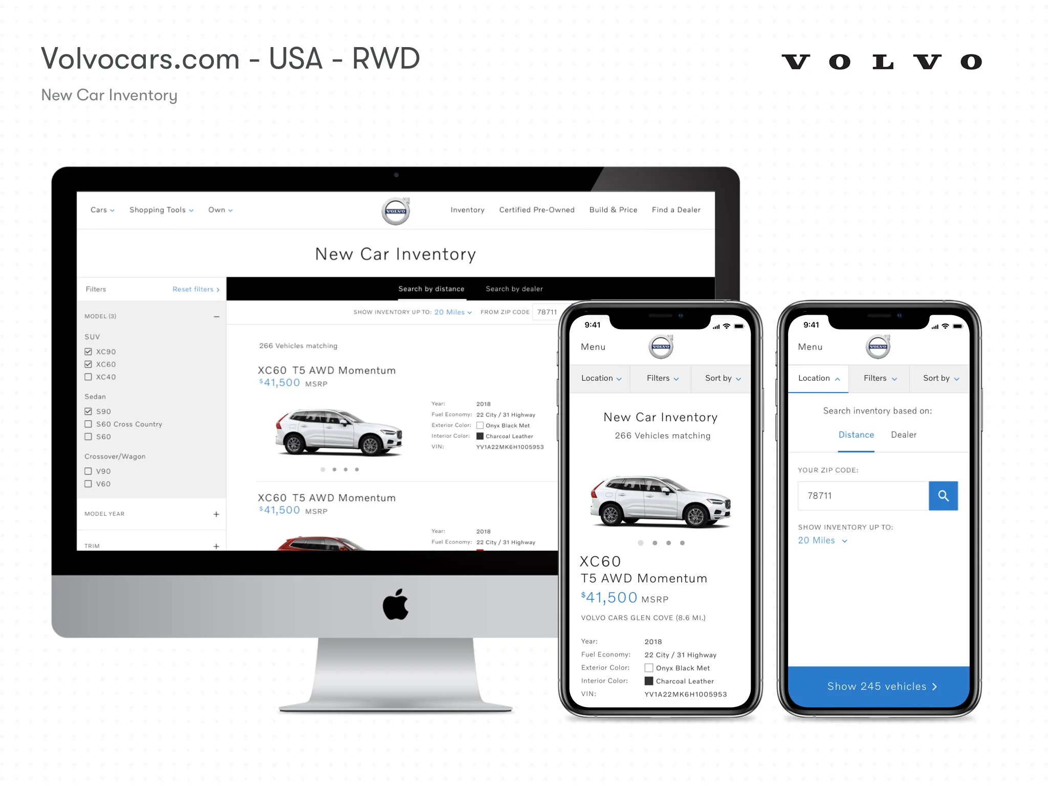
New Car Inventory
Redesigned the existing new car inventory of volvocars.com/us to provide the best user experience and allow users to find the models they are looking for quickly.
Pain-Points of the customers
The user couldn't be able to search the car availability in their preferred dealer’s inventory.
“Change Search Location” was not easily accessible so the users faced difficulty on both desktop and mobile.
“Refine Search & Sorted by” tab gets hidden while scrolling down the page.
Contents were not organized well. And also, design was outdated and bored.


Our Solutions
Drawing from our research insights, I focused on designing solutions that directly addressed user pain points and made the car-buying journey more seamless.
Designed a new landing page for the car inventory, where users can easily enter their zip code and select a car model to begin their search, removing unnecessary steps and creating a more personalized experience.
On the search results page, I introduced a ‘Search by Dealer’ option, enabling users to locate vehicles in their preferred dealer’s inventory quickly, building trust and convenience.
Improved accessibility by making the Filters and Change Zip Code options more prominent and easily usable on both desktop and mobile.
Carefully structured and organized the content to present information clearly, thereby reducing cognitive load and enabling users to make decisions with confidence.
These enhancements not only improved usability but also delivered measurable business impact. The redesigned experience increased the conversion rate by 18% in the first two weeks and by 43% within the first month of launch.


Electrification
Designed a plug-in module that helps users quickly estimate how much they could save annually on their commute by switching to a Volvo T8 or a fully electric vehicle. In addition to cost savings, the tool also provides clear information on available tax incentives and benefits, empowering users to make more informed and confident decisions about switching to electric vehicles.
This project began with a simple observation during my work on the New Car Inventory feature. While visiting Kundert Volvo Cars of Hasbrouck Heights to conduct user research, I spoke with several customers to gain a deeper understanding of their experiences with the existing inventory system. In those conversations, many expressed frustration about the difficulty of finding benefits and tax incentives for hybrid models.
At that time, customers had to visit the dealership in person to access this information—a frustrating barrier that not only created a poor user experience but also risked reducing sales. Recognizing the significance of this pain point, I presented these findings to the business team, explaining how the lack of accessible information had a negative impact on both customers and conversions. The leadership team agreed and asked me to design a solution.
Objective
Help customers easily discover tax incentives, yearly savings, and benefits of purchasing Volvo hybrid and fully electric models—making the buying decision easier, faster, and more informed.
Customer Needs
Clear information on federal and state tax incentives & benefits.
Personalized yearly savings calculations based on commute.
Access to charging station locations across the U.S. (planned for later phase).
Challenges
I started this project from scratch, with no existing data or tools. It was my responsibility to:
Conduct research and gather verified information to define the scope.
Collaborate with cross-functional teams—including legal, sales, and marketing—to ensure compliance and accuracy.
Work closely with product owners, engineers, and developers to transform these requirements into a functional, user-friendly module.
Solutions
Tax Incentives & Benefits – Pulled verified data from fueleconomy.gov and, with Volvo’s legal team, organized it into a customer-friendly format.
Savings Calculator – Partnered with the product owner, engineering, and development teams to create a formula that accurately calculated potential annual savings.
Daily Commute Concept – Introduced the idea of “Commute to Work”, where users simply entered their home and work addresses. The tool then calculated personalized results, including:
Yearly fuel/gas savings
Emission reductions
EV mode details
Time savings
Plug-in Module – Designed the feature as a flexible plug-in, so it could be integrated into multiple parts of the website.
Charging Stations – Scoped as a next-phase enhancement, since Volvo was partnering with third-party vendors to provide this data.
Result
The Electrification Module was launched successfully and delivered an immediate impact. Within its 6 months, the feature contributed to a 38% increase in conversions. More importantly, it empowered customers with knowledge, reduced friction in the decision-making process, and strengthened Volvo’s positioning as a leader in sustainable mobility.


South Florida - Microsite
Volvo launched a sales campaign in Florida and required a dedicated microsite to support the initiative. The microsite was designed to provide customers with easy access to the region’s featured offers, help them locate nearby Volvo dealerships, and enable them to compare Volvo models against those of competitor brands. The goal was to create a simple, informative, and persuasive digital touchpoint that encouraged customers to explore Volvo’s offerings and drive campaign conversions.

