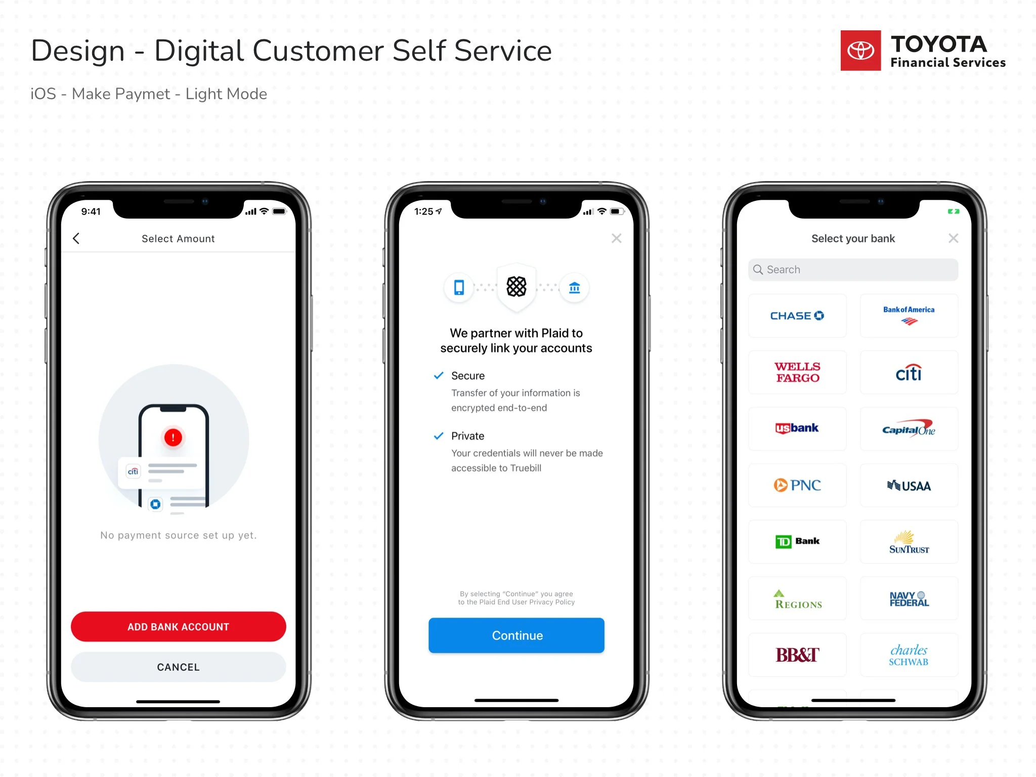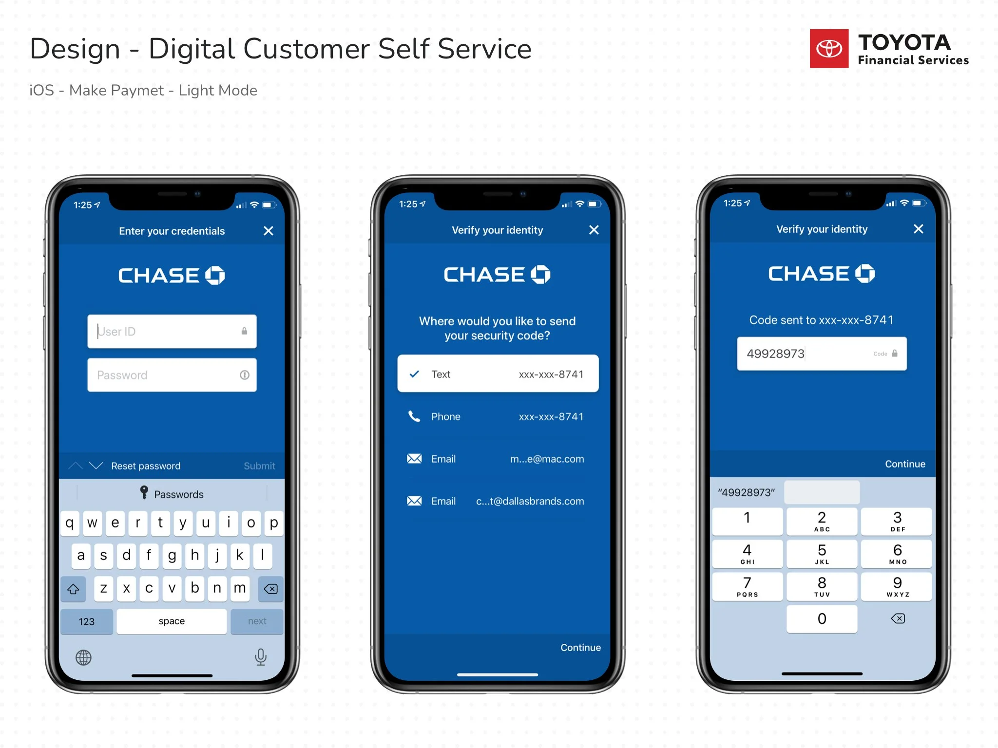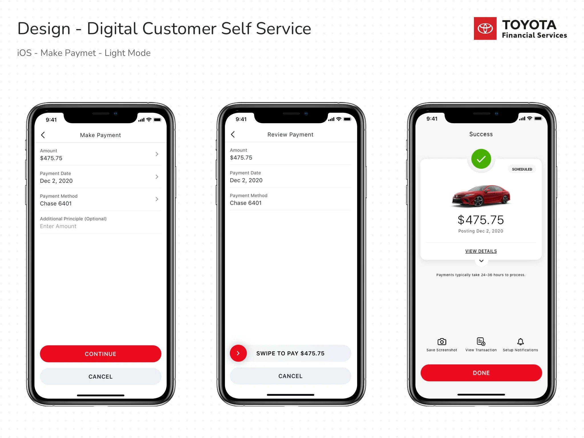
The myTFS mobile app
Toyota Financial Services sought to transform their myTFS mobile app for iOS and Android—an essential platform where customers make loan and lease payments, view billing and transaction history, manage multiple accounts, and customize features like multi-factor authentication and paperless settings. While the app served a critical purpose, customer feedback revealed friction in key journeys and a need for a more intuitive, modern experience.
My company was invited to pitch this redesign opportunity. To demonstrate our vision, we built a 12-week proof of concept (POC): eight weeks dedicated to UX/UI design, followed by four weeks of development. The engagement was structured to not only address customer pain points but also showcase tangible improvements through working prototypes.
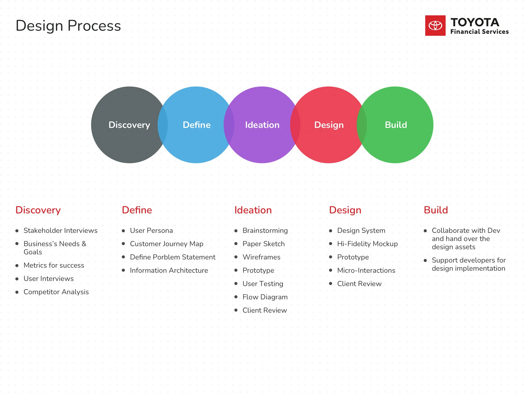
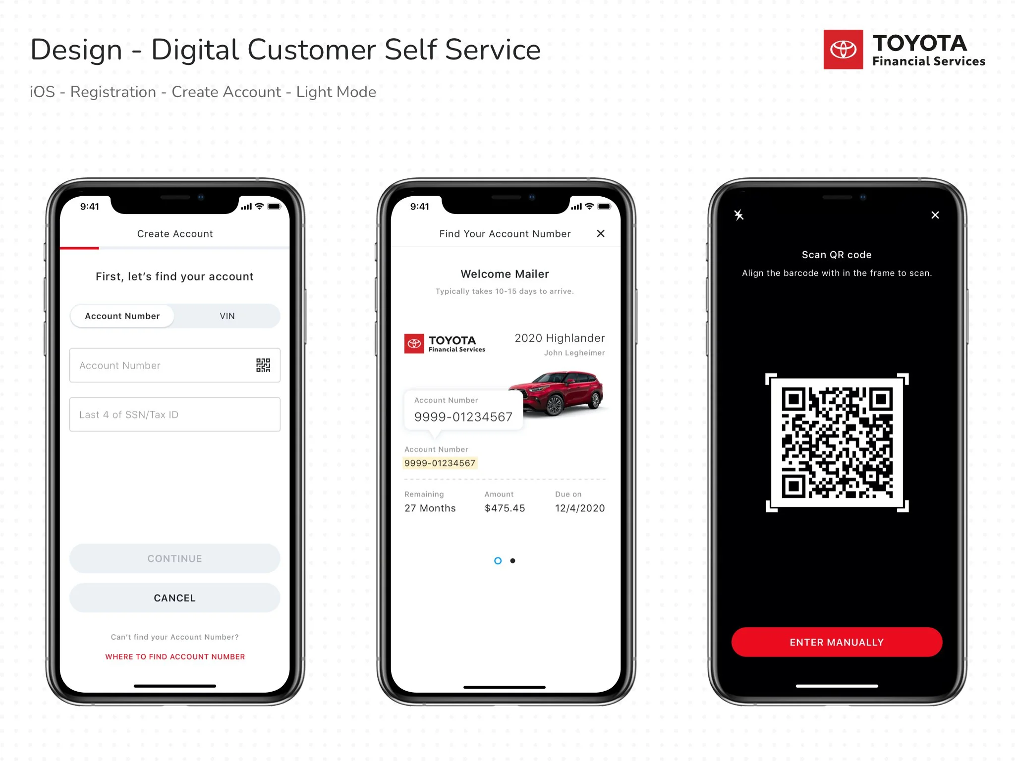
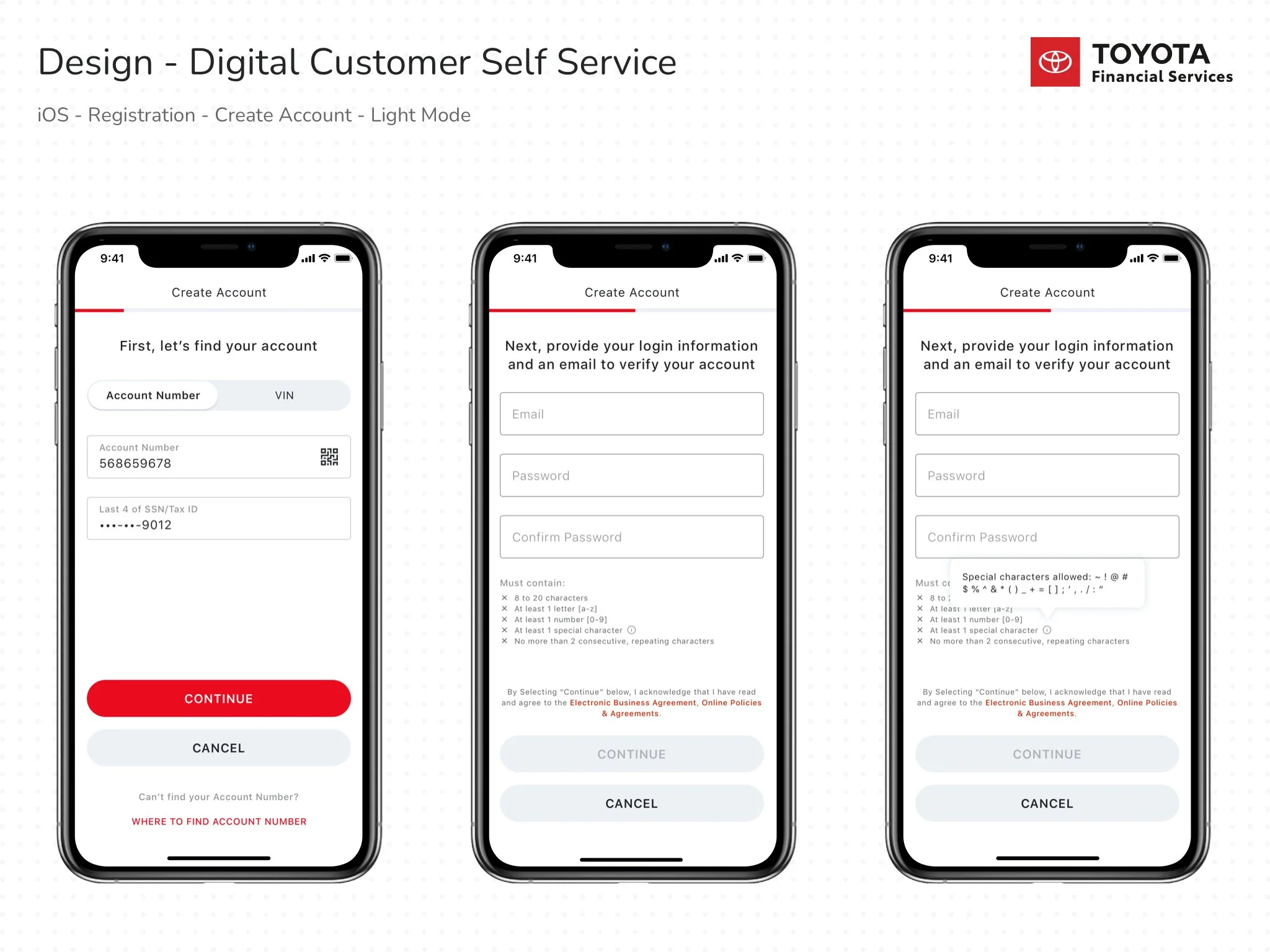
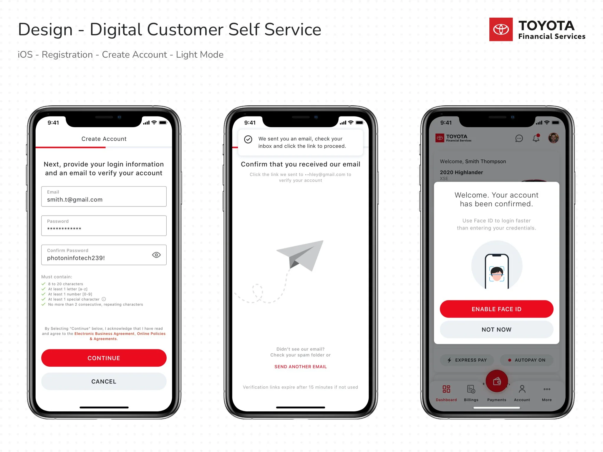
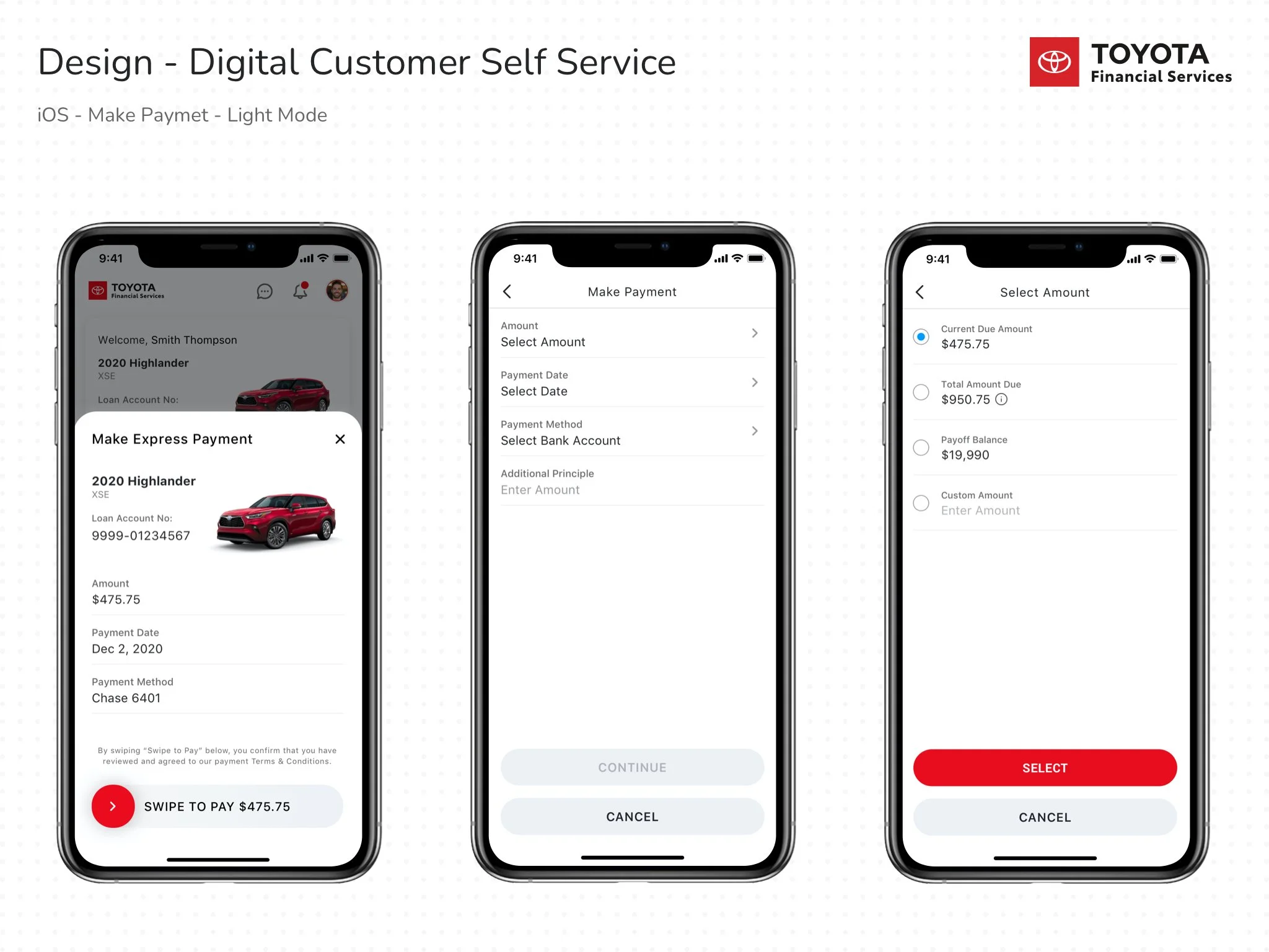
During the first phase, I led the design track as Lead UX/UI Designer. My responsibilities spanned the full design lifecycle—stakeholder interviews, requirement gathering, user research, ideation, and concept validation. We mapped customer pain points and presented actionable solutions, followed by low-fidelity wireframes of critical flows like Registration and Make a Payment. By week eight, I had developed a basic design system, refined high-fidelity mockups, and prototypes that captured the “happy path” experience.
The development team then built functional demos of these redesigned flows, which we presented to Toyota’s business team at the end of week twelve. Our work highlighted not only the opportunities for improving usability but also how a scalable design system could accelerate future enhancements. Throughout the process, I collaborated closely with cross-functional teams, supported developers during implementation, and contributed to brainstorming and stakeholder discussions to align on design vision and execution.
This project exemplified how thoughtful UX design, combined with rapid prototyping and cross-functional collaboration, can reimagine a financial app into a seamless and customer-first experience.
Discovery
During the discovery phase, our focus was on gaining a deep understanding of the business model, project vision, and goals through stakeholder interviews. I also reviewed existing research, design assets such as the style guide, and conducted a competitive analysis to benchmark industry practices. Using these insights, I defined clear business goals and established key success factors to guide the design process.
Business Goals
Build a complete pack of self-service account management tool to support TFS customers throughout their lifecycle
Maintain consistency across all the platform
Resolve the user's frustrations in the existing app, improve the engagement, and provide a seamless experience across the app.
Reduce the customer support call volume
Create opportunities for retention.
Improve the app ratings in the App Store and Play store. The existing app was rated two stars.
Metrics for Success
Monthly payment completion rate
Payoff completion rate
Support Call volume rate
Percentage of retention rate
Product Definition Statement
“An industry-leading self-service account management tool to support TFS customers throughout their lifecycle.”
Research
Empathized with customers to uncover their needs, motivations, behaviors, pain points, and expectations. This was achieved through direct feedback, user interviews, and observational studies, enabling me to gain a comprehensive understanding of their journey. These insights not only highlighted the challenges users faced but also revealed opportunities to create solutions that aligned closely with their goals and improved their overall experience.
Competitive Analysis
Conducted a detailed competitive analysis to identify key players in the market and evaluate their product strategies. This involved studying their features, design patterns, and overall user experience to understand how they addressed similar challenges. In addition to analyzing competitors, I researched current industry best practices and emerging trends, ensuring that the solutions we proposed were not only innovative but also aligned with established standards. This analysis provided valuable benchmarks and inspiration, helping shape a design approach that was both differentiated and user-focused.
Define
In the second phase, we analyzed and synthesized the research findings to identify key patterns and insights. Using this data, we developed user personas and mapped their end-to-end experiences, which allowed us to visualize their needs, motivations, and pain points. These artifacts helped uncover opportunities for improvement and guided us in shaping a more intuitive and impactful user experience.
Persona
Customer Journey Map
Customer's pain points
Limited Self-Service Capabilities
The system allows duplicate payments
Couldn’t make additional payments
Painful registration process
Frustration in managing multi-account
Couldn’t access Lease /Loan contract documents
No FAQ / Chat
Couldn’t apply for the loan
Long waiting time on a support call
Inconsistency between the mobile app and website experience
No info about payment status, principal, interest, and so on
Outdated & sluggish design interface.
Our Proposal for Success Analysis
Optimize the experience and make it a holistic digital self-service
Optimize the registration process.
Optimize all the features for both mobile and web
Provide a seamless experience across all the platforms.
Introduce Onboarding process
Provide helpful FAQ section and Chatbot support to reduce call volume.
Provide compelling and timely notifications that keep users engaged.
Able to access all the documents
Provide the ability to manage multiple accounts.
Provide clear info about payment, principal, interest, and so on.
Give users the ability to set up automatic payments and make additional payments.
Ability to make an express payment
Provide 4 digit pin fast login option as an alternative to entering the full credentials.
Introduce multi-factor authentication (MFA) option.
Expose users to offers and incentives that encourage them to enter a new lease or loan.
Compelling interface design
Quick view about account information before login.
Create an enjoyable and customized experience that users love coming back to
Problem Statement: The TFS customers want to manage all aspects of their accounts on their own, but the limited and confusing experience of the myTFS app makes them feel frustrated and helpless.
Information Architecture
Ideation
During the ideation phase, I concentrated on generating a diverse range of ideas through collaborative brainstorming sessions. These sessions encouraged open exploration, allowing me to think beyond obvious solutions. Once I had a pool of concepts, I translated them into sketches and low-fidelity wireframes to visualize the possibilities and quickly bring structure to our ideas.
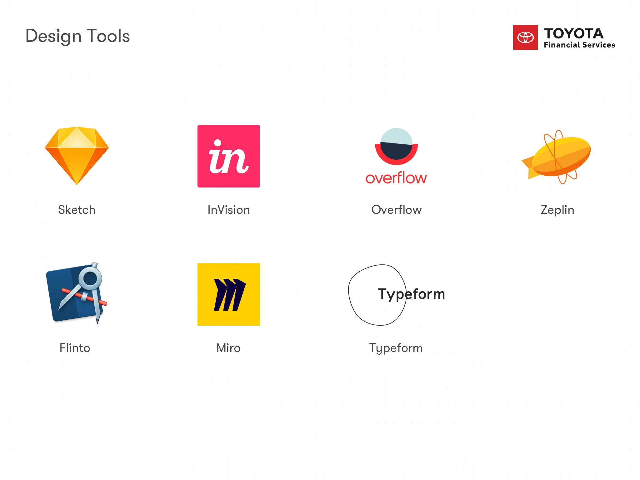
To validate our assumptions early, I used InVision to build rapid prototypes and conducted user testing sessions. This iterative process provided us with direct feedback from users, enabling me to refine the designs and ensure they aligned with real needs and expectations.
In addition, I developed detailed flow diagrams to illustrate the end-to-end process. These diagrams became an effective communication tool for stakeholders, ensuring everyone had a shared understanding of the proposed solutions and how users would interact with them.
Wireframes
Flow Diagram
Design
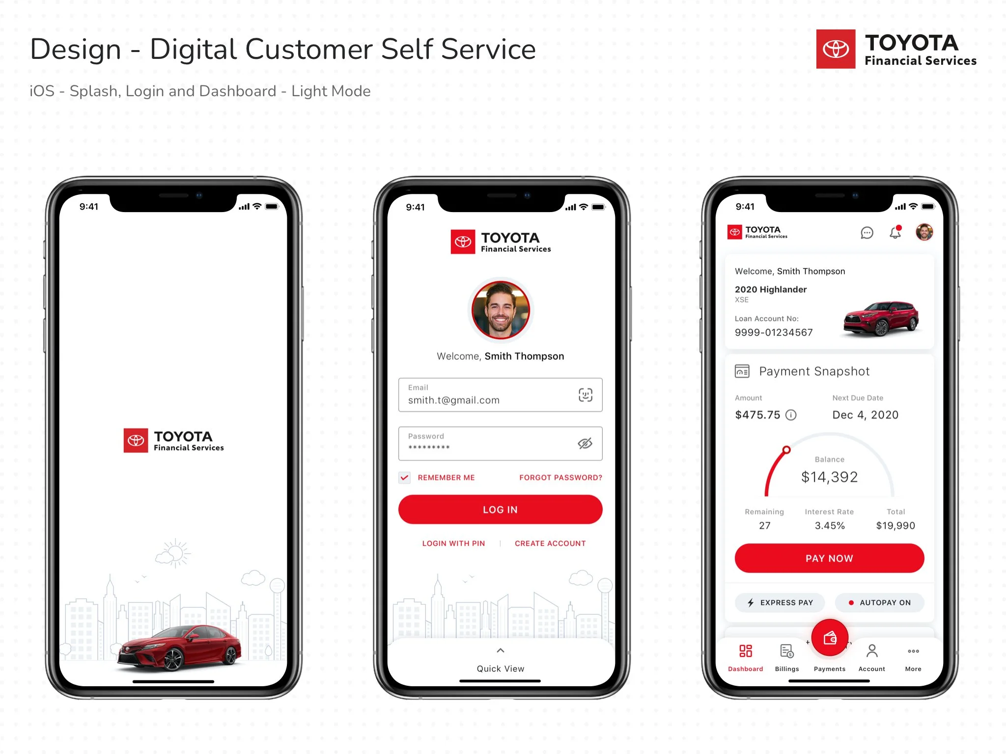
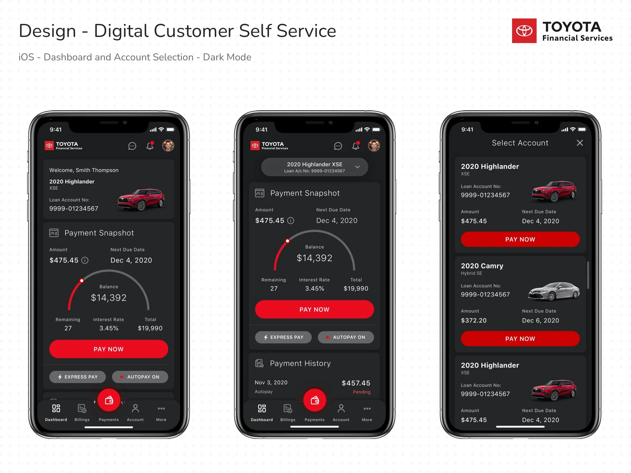
During the design phase, I built a comprehensive design system for the app, ensuring consistency and scalability across all platforms. Grounded in the Toyota Financial Services (TFS) branding style guide, the system established a unified visual language that included typography, color palettes, spacing rules, and reusable UI components tailored specifically for iOS. To enhance accessibility and adaptability, I designed patterns that supported both light and dark modes, allowing users to choose the interface that best fits their preferences.
Beyond foundational UI elements, I focused on creating a simple, intuitive, and visually compelling experience. I crafted custom icons and illustrations to reflect the brand’s identity while adding a layer of personality and engagement to the interface. To make interactions more delightful, I designed subtle micro-interactions for key elements, such as icon animations and state transitions. These details not only elevated the look and feel of the app but also reinforced usability by providing clear, responsive feedback to user actions.
The result was a cohesive design system and interface that not only aligned with TFS’s brand identity but also delivered an engaging and memorable experience for users
After Thoughts
For future improvement, I have a couple of suggestions:
Introduce the onboard process to provide customers with a personalized dashboard.
Provide the ability to customize the dashboard based on customers’ needs.
Provide the ability to view other accounts/switch accounts on the payment page itself.
Provide options to change the due date.
Display the payment status on the dashboard to prevent duplicate payments.
Interactive Prototype:
I created an interactive prototype using Figma (formerly Flinto) to demo it to the TFS Leadership team.
Build
In the final phase, I ensured a smooth transition from design to development by uploading all the approved comps into Zeplin and sharing detailed specifications with the engineering team. Throughout implementation, I worked closely with developers, clarifying requirements and providing design support to maintain consistency and quality across the app.
By the end of the 12th week, the development team delivered a live demo of the app to the TFS leadership team. The presentation not only showcased the functionality but also reflected the design vision we had established. The leadership team expressed their appreciation for the rigor of the discovery process, the clarity of deliverables, and the collaborative spirit demonstrated throughout the engagement.
This positive feedback reinforced the value of a user-centered approach and positioned the project for long-term success. Building on this momentum, I continued to support the team as we transitioned from the proof of concept to a full-scale project engagement, carrying forward the same principles of collaboration and design excellence.
New Update
Successfully launched the redesigned myTFS app (MVP) at the end of July 2021, and the results have been incredibly rewarding. The app, which previously held a 2.0 rating, quickly rose to a 4.7-star rating on the App Store thanks to positive user feedback. Seeing such a transformation in both customer experience and perception has been an inspiring milestone!
Toyota Financial Services - App store
